When I am selecting any system, planet list at right looks just right... until I am selecting any of this planet. Then in any case selection area looks slightly (or not-so-slightly) misplaced. Look on this screenshot:
There is Mars selected. But selector is mostly between Mars and Jupiter!
Can you change planets placement to match actual selector highlight? Or maybe move highlight to the correct position? Thank you!
[1.0.1.108]Misplaced planet selector.
Re: [1.0.1.108]Misplaced planet selector.
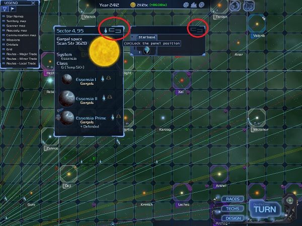
Did you notice the little chain like icons on the very top right of each of these sections? It appears from your screenshot that they are currently unlocked. This means that you can move them where you want by simply holding down the mouse button and dragging. When you get them where you want click on the little icon and it will lock in the position that you put them.
Here is a screenshot for you
keller~
- Smiling_Spectre
- Advisor
- Posts: 193
Re: [1.0.1.108]Misplaced planet selector.
Hmm. Sorry, English is not my native language, so it seems, my reply was too confusing. Second attempt:
I moved planet list at left. Just to be sure. It changed nothing. See highlight at the planet Icota II? It's off by 1/3 of planet (and takes 1/3 of the next planet, Icota III). It's always off. Less for the little planets, more for the big ones, but never right. I presume, some inconsistence between planet images in list and selector position exist, because if selector could be moved up for it's 1/3 height, it would be right for me.
...Oh, wait, I just noticed something: it's not selector that is off, it's planets! They are higher than needed, and at the bottom of the panel there is always empty space just enough to pull all planets down to the correct positions!
Re: [1.0.1.108]Misplaced planet selector.
You are right it's a bit down but the selector offset was intended by design to appear as it does currently and also to fit max 9 planets. Will can review this but can't promise it'll change.
Also if we push the planet down it won't look so good. The names of planets need to center with the planet.
Horizon - Lead Designer | a.k.a. Raf
- Smiling_Spectre
- Advisor
- Posts: 193
Re: [1.0.1.108]Misplaced planet selector.
I feel like I am missing something here. What can stop you to push the names same way down, keeping it centered? Is it prohibited by engine? %) Keep selector exactly same way as now, and pull down everything below the sun. There is enough space for that inside given boundaries. Here is little graphic modification of the existing (first) image - I pulled everything down, remaining in the same window:Zaimat wrote:Also if we push the planet down it won't look so good. The names of planets need to center with the planet.
Re: [1.0.1.108]Misplaced planet selector.
Ah, yes. Now I understand what you were meaning. The planet types are not centered underneath the planet names.
keller~
Re: [1.0.1.108]Misplaced planet selector.
In your example the name of the planet and it's type are shown. But each planet can also have 2 extra lines (defended/blockaded and specials/minerals). So the highlight is effectively the window size for the text and icons.
There are effectively 2 options for allowing a change, pushing the planet down (no longer centered with the name) or reducing the text lines.
Horizon - Lead Designer | a.k.a. Raf
- Smiling_Spectre
- Advisor
- Posts: 193
Re: [1.0.1.108]Misplaced planet selector.
*Sigh* I feel myself extremely stupid, not able to correctly express my thoughts with my words. Ok, I'll try the picture.keller wrote:Ah, yes. Now I understand what you were meaning. The planet types are not centered underneath the planet names.
Left one is the current state. Planet name is centered to the planet, and planet name tied to the upper edge of planet selector. It means that selector's upper edge is always slightly above planet center, so planets are always off-way, more or less.
Right one is what I want to see. With the planet name tied to the center (not upper edge) of selector. It means shifting all planets slightly down in window - and that's the all modifications, I suppose.
Re: [1.0.1.108]Misplaced planet selector.
Yes I understand, and your doing a fine job saying what you mean. It was me who did not read it correctly in your first post so I do apologize for that.
keller~